Introduction
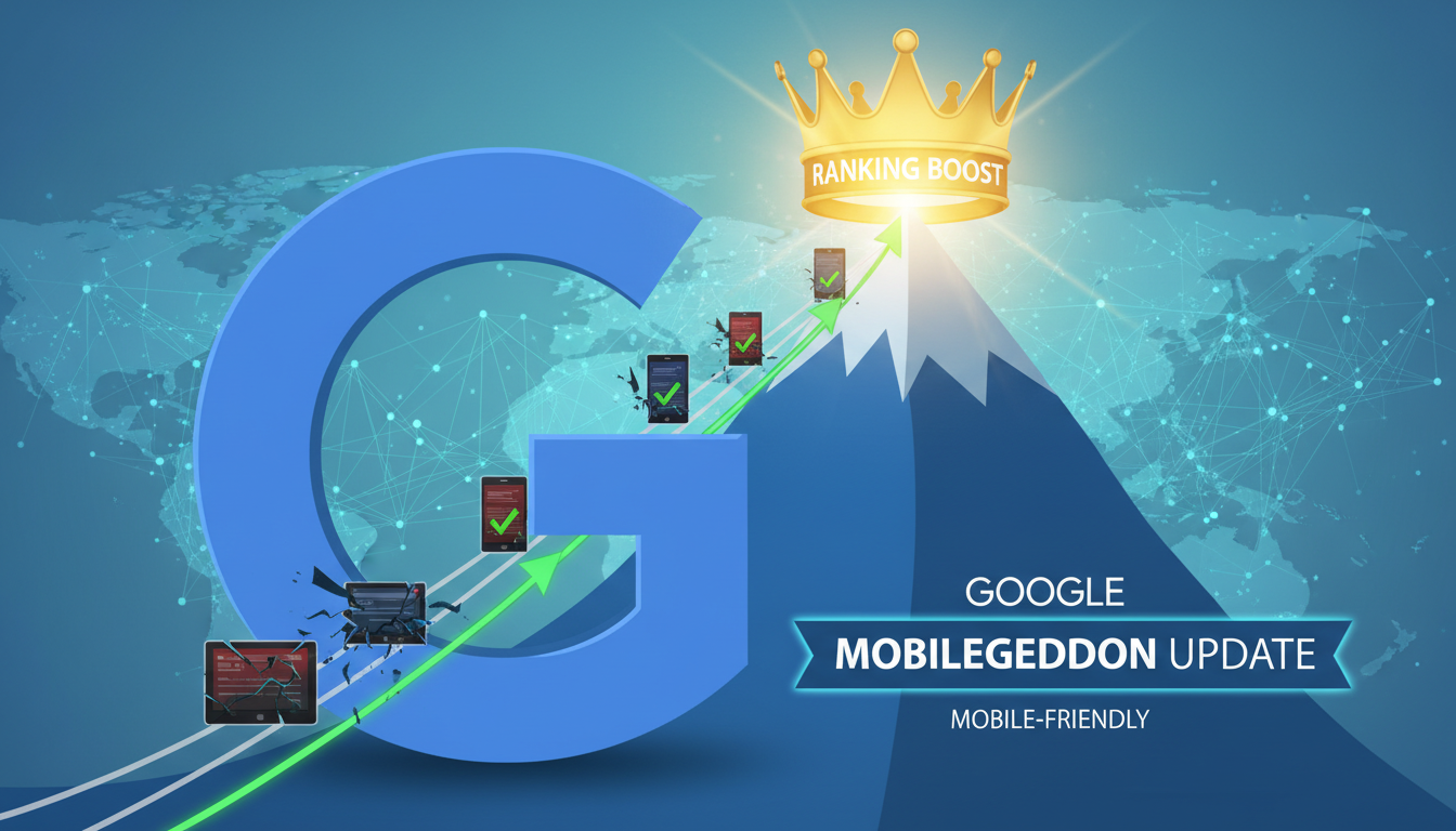
In the history of search engine optimization, few dates are as pivotal as April 21, 2015. This was the day Google released a massive algorithmic change that the industry colloquially dubbed the Google Mobilegeddon update. For years prior, the digital landscape had been slowly shifting away from desktop dominance, but this update marked the official tipping point where Google explicitly declared that the mobile user experience was no longer optional—it was a critical ranking factor.
The announcement sent shockwaves through the SEO community. Webmasters and business owners scrambled to ensure their sites were responsive, fearing a catastrophic drop in organic traffic. Unlike the mysterious nature of most algorithm changes, Google gave the world a heads-up about the Google Mobilegeddon update, signaling its profound importance. The update was designed to give a significant ranking boost to pages that were legible and usable on mobile devices, while demoting those that required users to pinch and zoom just to read the text.
Understanding the legacy and technical mechanics of this update is essential for any modern SEO strategy. It paved the way for Mobile-First Indexing and the Page Experience update. If you are struggling to understand why older sites lose visibility, revisiting the core principles of this update is often the key. In this comprehensive guide, we will explore the history, the technical requirements, and the lasting impact of Mobilegeddon on the concept of search engine optimization today.
The Catalyst: Why Google Forced the Mobile Shift
To understand the magnitude of the Google Mobilegeddon update, one must look at the data trends leading up to 2015. According to Statista, mobile internet traffic was exploding, yet the majority of the web was built solely for desktop monitors. Google’s primary mission is to organize the world’s information and make it universally accessible and useful. If a user searches for an answer on their iPhone but clicks through to a site that is broken, slow, or unreadable, Google has failed to provide a good user experience.
The update was a direct response to user behavior. Google recognized that if they continued to rank desktop-optimized sites high in mobile search results, users would become frustrated. Therefore, the algorithm was adjusted to prioritize the user’s context. This was not just about aesthetics; it was about functionality. The update introduced a binary signal: a page was either mobile-friendly, or it wasn’t. There were no degrees of friendliness in this specific iteration, making the mandate clear for developers.
This shift fundamentally changed how we approach digital marketing. It forced companies to abandon separate “m-dot” subdomains (which were often stripped-down versions of the main site) in favor of responsive web design. Today, mastering what is mobile SEO optimization is the baseline for entry into any competitive niche.
Decoding the Google Mobilegeddon Update Algorithm
The Google Mobilegeddon update was unique because it ran in real-time and operated on a page-by-page basis. This meant that even if your entire website wasn’t fully optimized, the specific pages that were mobile-friendly could still benefit from the ranking boost. Conversely, a single non-optimized page on an otherwise modern site could suffer in mobile search results. This granular approach allowed webmasters to upgrade their sites incrementally without losing total visibility overnight.
The algorithm checked for specific technical criteria to determine “friendliness.” These included:
- Viewport Configuration: Ensuring the page specifies a viewport meta tag so browsers know how to adjust the page’s dimensions and scaling to the device width.
- Legible Text: Fonts had to be readable without zooming. Google generally recommends a base font size of 16px.
- Tap Targets: Buttons and links needed to be spaced far enough apart so that a user’s finger wouldn’t accidentally press the wrong link—a common frustration on non-optimized sites.
- Playable Content: Avoiding software that is not common on mobile devices, such as Flash, which was effectively killed off by this movement.
Websites that failed these checks saw a noticeable decline in their mobile rankings. While the desktop rankings remained unaffected by this specific signal, the growing volume of mobile searches meant that losing mobile visibility was akin to losing half your audience. For businesses relying on local traffic, such as restaurants or emergency services, this was critical. If you are wondering why is my website not ranking on google local search, a lack of mobile optimization is frequently the culprit.
The Evolution: From Mobilegeddon to Mobile-First Indexing
It is crucial to distinguish between the Google Mobilegeddon update of 2015 and the Mobile-First Indexing rollout that began in 2018. Mobilegeddon was a ranking signal change; it simply boosted mobile-friendly pages in mobile search results. However, Google still used the desktop version of a site to determine its content relevance and authority.
Mobile-First Indexing changed the game again by flipping the script. Google began using the mobile version of the content for indexing and ranking. This meant that if your mobile site had less content than your desktop site, your rankings would tank—even on desktop searches. The 2015 update laid the groundwork for this transition by forcing the web to get its infrastructure ready.
During this evolution, new technologies emerged to help speed up the mobile web. One such initiative was Accelerated Mobile Pages (AMP). While AMP is no longer a strict requirement for appearing in the Top Stories carousel, the underlying principle remains: speed is king. The legacy of Mobilegeddon is that it made performance and layout inseparable from SEO strategy.
Ranking Factors: Speed and User Experience
In the years following the Google Mobilegeddon update, the criteria for mobile optimization have expanded beyond simple layout adjustments. Google now assesses the holistic Page Experience, which includes Core Web Vitals. These metrics measure how fast a page loads (Largest Contentful Paint), how quickly it responds to interaction (Interaction to Next Paint), and how stable the layout is (Cumulative Layout Shift).
A site that is “mobile-friendly” by 2015 standards might still fail today if it is bloated with heavy scripts or uncompressed images. Modern SEO requires a deep understanding of how to optimize Core Web Vitals for mobile. If a user taps a link and the page shifts, causing them to click an ad instead, that is a poor experience that Google’s algorithms are now trained to detect and penalize.
Furthermore, the rise of voice search and local intent has tied mobile optimization directly to semantic search. Mobile users often search for “near me” queries or ask questions via voice assistants. Ensuring your content is structured to answer these immediate needs is the next layer of mobile optimization.
How to Survive and Thrive in a Mobile-First World
For businesses today, surviving the legacy of the Google Mobilegeddon update means adopting a “mobile-first” design philosophy. This involves designing the website for the smallest screen first and then scaling up to desktop, rather than the other way around. This ensures that the most critical content is prioritized and lightweight.
Here are actionable steps to ensure your site remains compliant and competitive:
- Responsive Design: Use CSS media queries to adapt your layout to any screen size. This is Google’s recommended configuration.
- Speed Optimization: Compress images, minify CSS/JS, and leverage browser caching. Slow mobile sites have high bounce rates.
- Structured Data: Implement schema markup to help Google understand your content, which is vital for appearing in rich snippets on mobile screens where real estate is limited.
- Avoid Intrusive Interstitials: Pop-ups that cover the main content immediately after a user navigates to a page from search results can incur a penalty.
If you are unsure where your site stands, using tools like Google Search Console is non-negotiable. It provides a specific “Mobile Usability” report that flags issues like text being too small or content being wider than the screen. Addressing these technical errors is often the first step in a broader audit. For a deeper dive into technical health, you should review how to do technical SEO step by step.
The Economic Impact of Mobile-Friendliness
The economic implications of the Google Mobilegeddon update were clear: adapt or die. Major brands that failed to update their sites saw double-digit drops in organic traffic. According to a report by Search Engine Land, non-mobile-friendly sites lost significant visibility shortly after the rollout. Conversely, nimble startups and forward-thinking companies that embraced responsive design saw a surge in market share.
This update also democratized the playing field. A small local business with a fast, mobile-optimized site could outrank a national competitor whose legacy infrastructure made their site unusable on a smartphone. This reinforces the importance of understanding the myriad Google ranking factors that go beyond just keywords and backlinks.
Today, the cost of ignoring mobile SEO is even higher. With mobile devices accounting for over half of all global web traffic, a non-responsive site is effectively invisible to 50% of your potential customers. The update shifted the mindset from “mobile is an add-on” to “mobile is the primary product.”
Frequently Asked Questions
When was the Google Mobilegeddon update released?
The Google Mobilegeddon update was officially rolled out on April 21, 2015. It was one of the few updates that Google pre-announced months in advance to give webmasters and developers time to prepare their websites for the shift toward mobile-friendly ranking signals.
Does the Mobilegeddon update still affect rankings today?
Yes, but it has evolved. While the original update laid the foundation, mobile-friendliness is now a baseline requirement rather than just a “boost.” Google now uses Mobile-First Indexing, meaning the mobile version of your site is the primary version used for ranking. A site that is not mobile-friendly will struggle significantly in search results.
How do I know if my website is mobile-friendly?
You can check your site’s status using Google Search Console’s “Mobile Usability” report. Additionally, you can manually test your site on various devices or use browser developer tools to simulate different screen sizes. Look for issues like horizontal scrolling, text that is too small to read, or clickable elements that are too close together.
What is the difference between Mobilegeddon and Mobile-First Indexing?
The Google Mobilegeddon update (2015) was a ranking signal change that boosted mobile-friendly pages in mobile search results while the desktop version remained the primary source for indexing. Mobile-First Indexing (started in 2018) means Google primarily uses the mobile version of the content for indexing and ranking across all devices, including desktop.
Will my desktop rankings drop if my site isn’t mobile-friendly?
Directly, the 2015 update only affected mobile search rankings. However, under the current Mobile-First Indexing system, if your mobile site is poor or non-existent, it can negatively impact your overall SEO performance because Google judges your site based on its mobile version. Furthermore, poor user experience on mobile leads to bad engagement metrics, which can indirectly hurt overall authority.
Conclusion
The Google Mobilegeddon update was a watershed moment in the history of the internet. It marked the end of the desktop-centric era and forced the digital world to prioritize the user experience on the devices they use most. While the name suggested an apocalypse for websites, it was actually a necessary evolution that improved the web for everyone. For webmasters and SEOs, the lesson remains clear: adapt to user behavior or risk obsolescence.
Today, maintaining a mobile-friendly website is not just about avoiding penalties; it is about providing value. By focusing on responsive design, fast load times, and intuitive navigation, you ensure that your content is accessible to the widest possible audience. As search technology continues to advance towards AI and voice interaction, the foundational principles established by this update—accessibility, speed, and user-centricity—will remain the pillars of successful digital marketing.

Saad Raza is one of the Top SEO Experts in Pakistan, helping businesses grow through data-driven strategies, technical optimization, and smart content planning. He focuses on improving rankings, boosting organic traffic, and delivering measurable digital results.